Typography style is required in designing photos and websites, influencing how we perceive and interact with information especially for business. Choosing the best font family is essential for effective communication. In this article, we’ll explore some of the best typography fonts and explain why each one stands out.
| Font Family | Popular Companies that Use Each Font Style |
|---|---|
| Helvetica | American Apparel, BMW, 3M |
| Arial | Microsoft, LinkedIn, IBM |
| Times New Roman | The New York Times, The Washington Post, Time Magazine |
| Garamond | Adobe, Apple Books |
| Roboto | Google, Android |
| Futura | Volkswagen, Supreme |
| Verdana | Microsoft, Amazon |
| Bodoni | Vogue, Calvin Klein |
| Comic Sans | Dyslexia Schools |
| Avenir | Airbnb, Volvo, Lufthansa |
Please note that printed font choices for company branding can vary, and some companies may use multiple fonts for different purposes. Additionally, the use of certain typography, like cursive fonts, is generally discouraged in professional and formal contexts.
Sections:
What are the Top 10 Best Font Family for PWD Accessibility?
Ensuring websites are accessible for people with disabilities is important. The choice of fonts plays a vital role in making content easy to read when starting a business. Here, we’ve compiled a list of the top 10 font families known for their popularity and effectiveness in enhancing accessibility for people with disabilities (PWD).
These typography like Google fonts prioritize clarity, legibility, and a user-friendly experience, contributing to a more inclusive online environment.
1. Helvetica: Timeless Simplicity

Helvetica is a classic font known for its clean lines and simplicity. Its neutral appearance makes it versatile and suitable for a wide range of applications. Whether used in print or digital media, Helvetica maintains readability and aesthetic appeal. Its timeless design ensures that it remains a popular choice among designers.
2. Arial: Clear and Legible

Arial is often compared to Helvetica, but it has its own distinct characteristics. Arial is known for its clarity and legibility, especially in digital formats. It’s a go-to choice for websites and presentations, offering a clean look that ensures information is easily digestible. Arial’s widespread availability also contributes to its popularity.
3. Times New Roman: Traditional Elegance
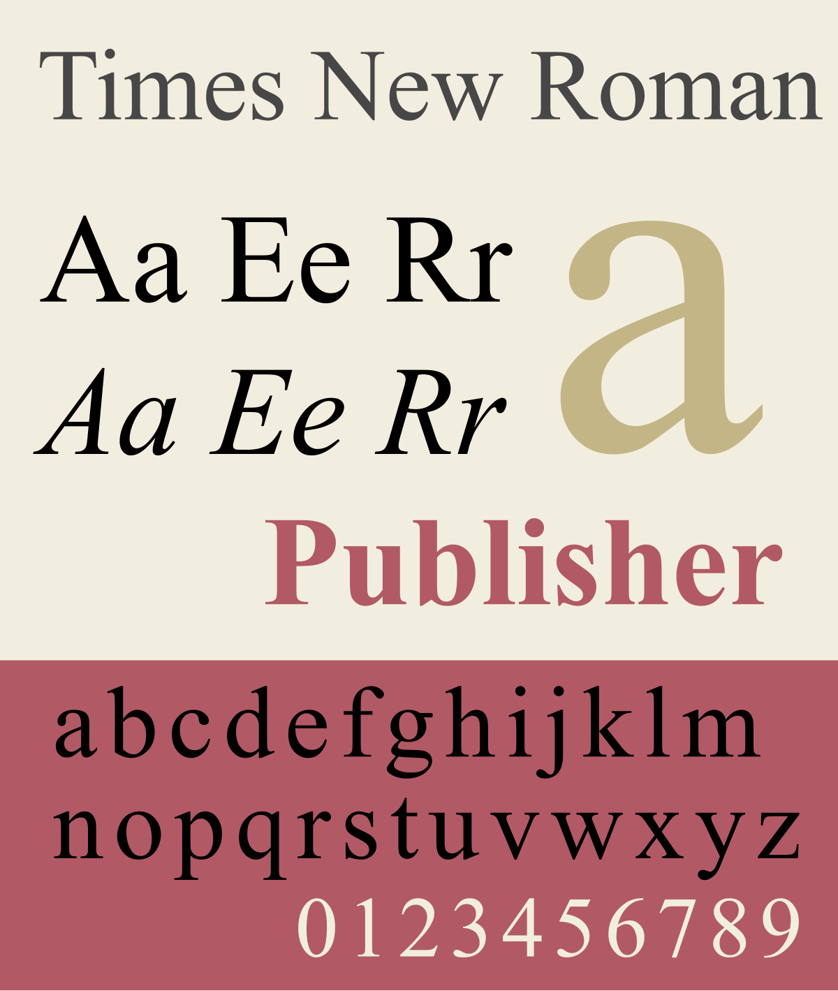
Times New Roman exudes a sense of tradition and elegance. Widely used in print, particularly for academic and formal documents, it imparts a classic and sophisticated feel. Its well-defined serifs contribute to readability, making it a preferred choice for long-form content like essays and research papers.
4. Garamond: Timeless Serif Beauty
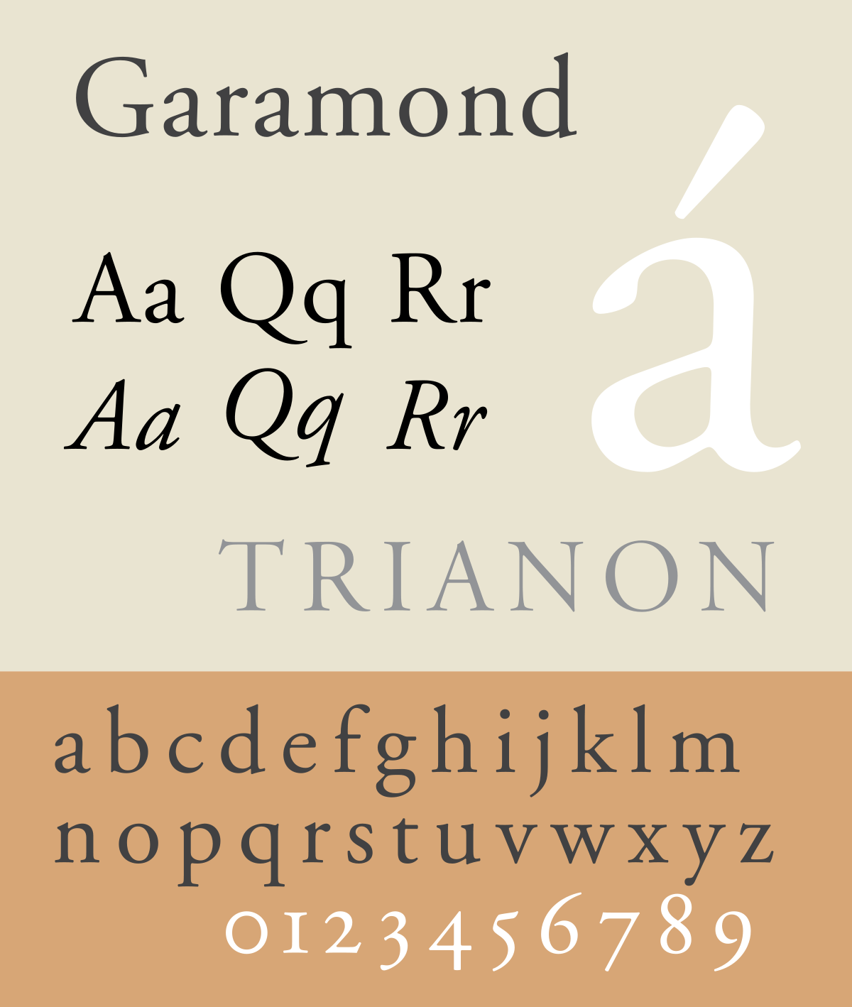
Garamond is a serif font with a rich history dating back to the 16th century. Its graceful and balanced letterforms lend an air of sophistication to any design. Garamond is often favored for book typography due to its readability, making it an excellent choice for body text in print materials.
5. Roboto: Simple and Readable

Roboto font is good for typography because it looks clean and modern. The letters are usually easy to read, making it great for conveying information clearly. Its simple and futuristic design can give a high-tech or professional vibe to a document or website. Robot font is versatile and works well in various sizes, from small text to headlines. It often has a neutral appearance, making it suitable for a wide range of content.
6. Futura: Modern Geometric Appeal
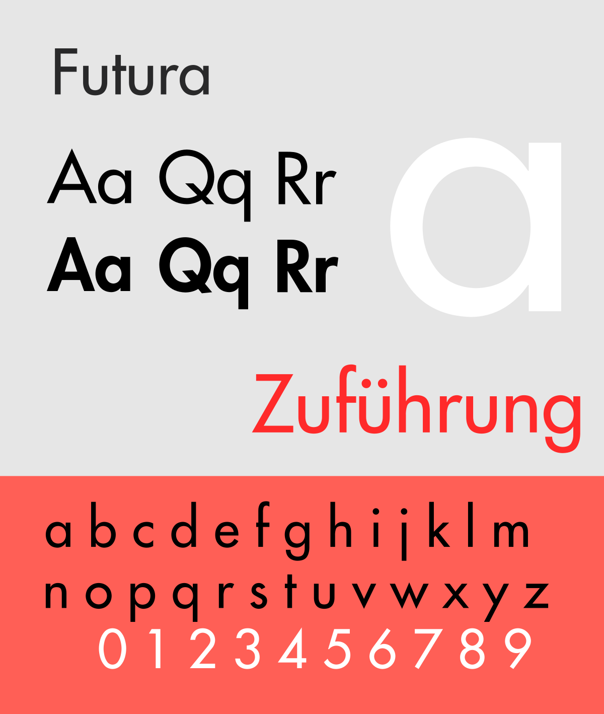
Futura is a geometric sans-serif font that radiates modernity. Its clean, straight lines and circular shapes give it a futuristic vibe. Futura is popular for conveying a sense of forward-thinking design and is often used in logos, headlines, and posters. Its geometric precision makes it a favorite for contemporary applications.
7. Verdana: Digital Readability

Designed specifically for digital interfaces, Verdana is a sans-serif font made by Matthew Carter for Microsoft Corporation. It offers excellent readability on screens of all sizes, making it a preferred choice for websites and mobile apps. Verdana has a eye-friendly design that enhances user experience in the digital realm.
8. Bodoni: High-Contrast Elegance

Bodoni is a serif font characterized by high contrast between thick and thin strokes, creating a dramatic and elegant look. Widely used in fashion and luxury branding, Bodoni’s distinctive style conveys a sense of sophistication. It’s best suited for short bursts of text or headings where its ornate details can shine.
9. Comic Sans: Casual and Approachable

While often criticized, Comic Sans has a place in informal and playful designs. Its casual and approachable appearance makes it suitable for children’s materials, party invitations, or any context where a lighthearted feel is desired. Despite its detractors, Comic Sans remains in use for specific applications.
10. Avenir: Harmonious Modernity

Avenir is a versatile and modern sans-serif font known for its harmonious proportions. Its balanced design makes it suitable for various purposes, from branding to body text. Avenir’s popularity lies in its ability to convey a contemporary aesthetic while maintaining readability across different mediums.
Which is the Best Font Style for Accessibility Compliance?

Selecting the best typography font depends on the context of your design. Whether you opt for the timeless simplicity of Helvetica, the traditional elegance of Times New Roman, or the modern appeal of Roboto, each font brings its unique characteristics to the table. Understanding the nuances of different fonts allows designers to make informed choices that enhance the visual impact and effectiveness of their work.